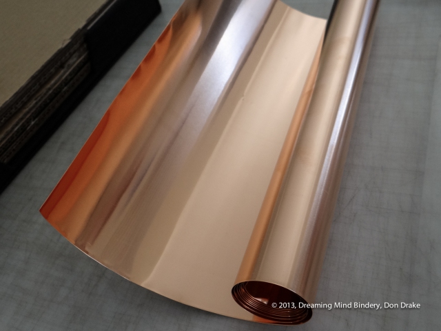
The first order of business was to get some copper and see what it would do. I did some copper embossing when I was 10 in Cub Scouts. I vaguely remember rubbing the copper down over a raised plastic image pattern. Looking around the web at examples, this seems to be the general way this is done.
So, what seemed to be the right copper product was ordered and here it is! Blank canvas time!

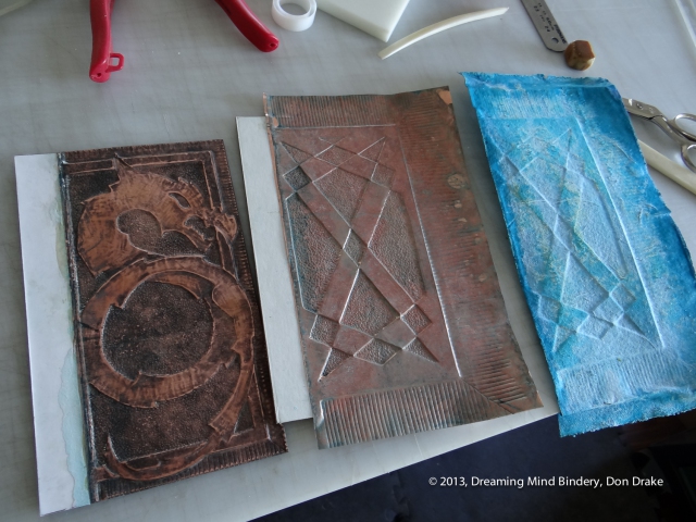
 I did some quick tests to see how the copper acted and get a feel for how I might design. How much detail could I get? If I create an embossing substrate, how deep should the steps be? How hard is it to shape the copper?
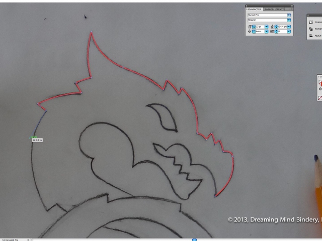
Now, with some idea of how the copper would perform and a general notion of what the design would be I need to start sketching. Not being a big follower of dragon motifs and wanting to evoke a degree of familiarity with the design, I start with the ubiquitous web search to see what the common design patterns are for a vertical space like my cover.
The S pattern shown in the detail shot is a very common solution for the kind of space I have. If I work from this pattern I'll get the kind of instant familiarity I want???a "classic" moment.


Next step, a took a picture of it and took it into Illustrator so I could do a digital tracing. That's what those red lines are in the (pleasantly ambiguous) main picture. Once I have a digital copy I'll be able to print it as many times as I need when making the substrate.
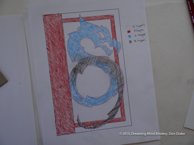
A color coded sketch used to plan the levels of the three dimensional substrate for a copper journal cover
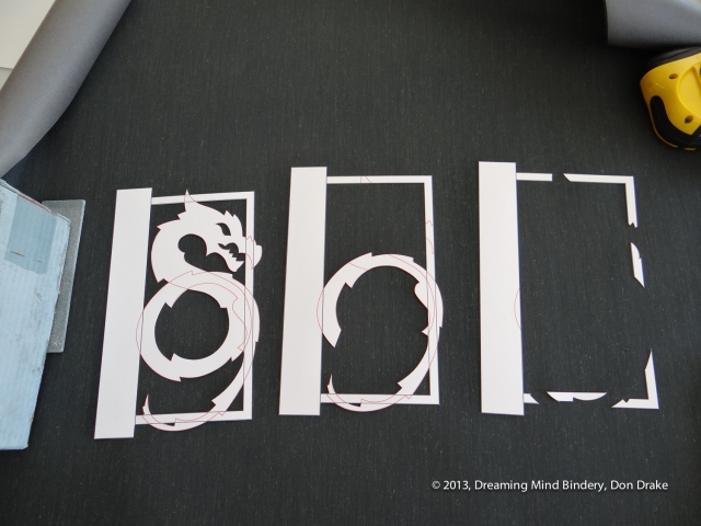

With my plan in hand I print 3 copies of my design on the card stock that will be layered on the cover and cut out the parts of the design I need for each level.
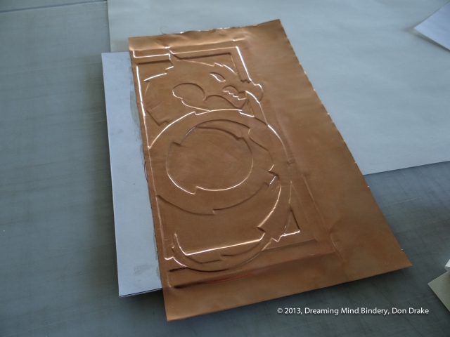
Debossing the copper onto the three dimensional substrate to create a copper journal cover
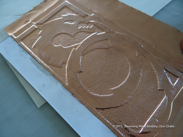

One thing I did notice, the copper didn't stay in close contact with the board after it was pressed. And I don't really like the tiny bit of float it has above the surface. I want the copper to be the cover, not be above the cover. To solve this in the finished piece I'll turn to contact cement. A coat on each surface and I'll have a nice solid result.
The detail image shows the first stage of working the copper. It looks more flat and lifeless than I was hoping. So, I blunt one of my awls and get down to the laborious work of stippling the background to create some texture and interest.
That's more like it. Still a bit new looking.
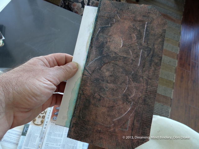
Back to the internet. "copper patina" revealed liver of sulphur and vinegar as blackening agents. I have vinegar. I'm not sure where to get l-o-s. So I started fiddling around with some of my earlier test scraps.
Applying the vinegar through a shop towel to keep a reservoir against evaporation worked. Salt seemed to enhance the action. And putting the whole mess in the sun seemed to add energy that accelerated the process.
The result is a bit murky and undefined. My wife didn't care for it, that's for sure. But this is only one more step in the process.
Note the parallel lines I scored in the turn-edge to add more texture.
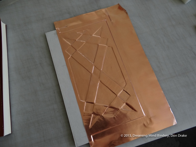
Debossing copper into a design for the back cover of a journal


A customer called looking for a replacement for a copper covered journal she had given her son. The journal was almost full and she liked that use of copper. The pictures she sent from her phone weren't too good, but I got the general idea.


Preliminary sketches of a dragon design to be used in a copper journal cover.
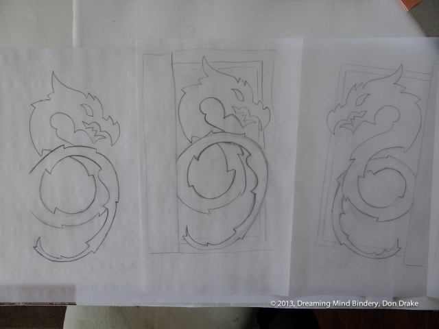
Preliminary sketches of a dragon design to be used in a copper journal cover.
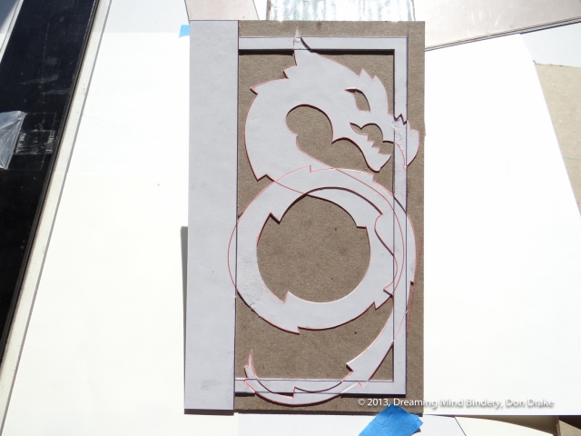
I glued all the cut outs on the cover board and got a little afternoon light raking across the surface to emphasize the depth of the substrate. Looks like it's time for some copper work.

And here's the finished piece! I'm very happy with the result. And it feels great in the hand. The interior is blank, the right choice since this is a sketchbook. I think my customer said her son works for Disney. Fun!
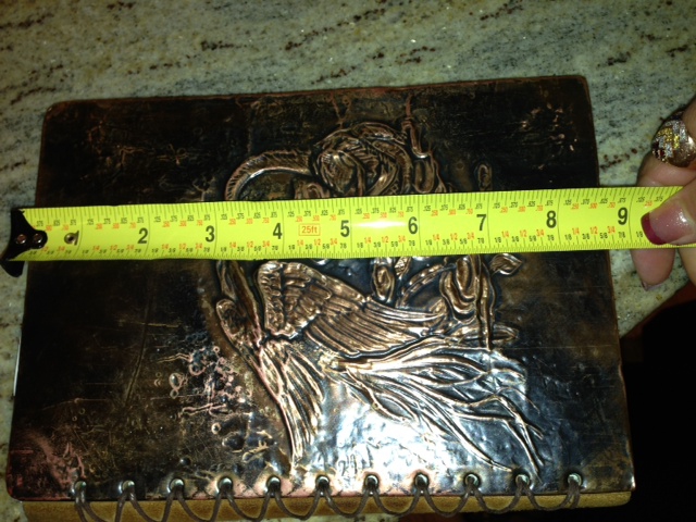
A copper covered journal (possibly bought in Ireland) that was the spark for a new binding order at Dreaming Mind Bindery
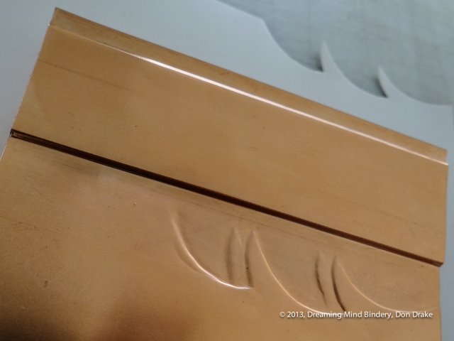
Testing sheet copper to see how it will perform in a copper journal cover

Testing sheet copper to see how it will perform in a copper journal cover