I'm always doing design sketches, notes and measurements on scraps of paper when I'm working so I thought I would use handwriting for my blog banner. Also, it would be somewhat harmonious with my bindery logo which was based on handwriting. And, Bench Marks? Yeah, the name demands I at least TRY this design strategy.
I wanted some weight to the words but didn't want the solidity of a fat marker. First I tried writing very small with pencil on a piece of vellum. Then when I enlarge the art to use-size the strokes would grow fat.
Though several attempts with backgrounds on my bindery site failed, I thought I start there again with this design. I shot this first test over a scrap of marble paper.
No too promising.
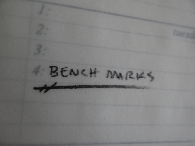
This second shot, laid over a weekly calendar page from a job I need to ship had promise. I like he way the words fall away in the distance.
But the area for the banner is so small (I'm working with a starting assumption of 95 pixels) I didn't think there would be enough context for this pictorial strategy to make sense.
I do like the play on note-taking, with the title positioned over a numbered line. Again though, I didn't think i would be clear in the finished design that I shot through vellum... it would just look ghosty and hazy without other contextual clues.
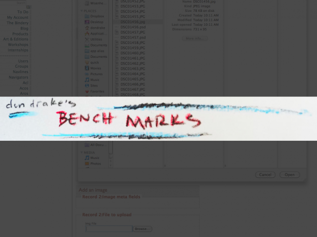
This one is based on the use of colored pencils. I'm pretty sure I want some color in he finished piece. As I've been uploading images to my development site to test things I noticed the evolving page could start looking very neutral and bland. I've adjusted my in-process shooing to compensate. But It seems like a bad idea to design a banner that contributes to the problem.
Again, his one was written very small so I could gain stroke weigh in he final version.
This design also starts to address some branding issues that I've been considering for a while. I originally named the bindery 'Dreaming Mind', avoiding the use of my name because I assumed I would want to sell the business at some point. While that's still my plan, I have found myself contemplating book-art as well as commission binding and I want to start segregating an identity as an artists separate from the business which could continue under different ownership.
So I'm taking personal ownership of the blog and branding it to reflect that.
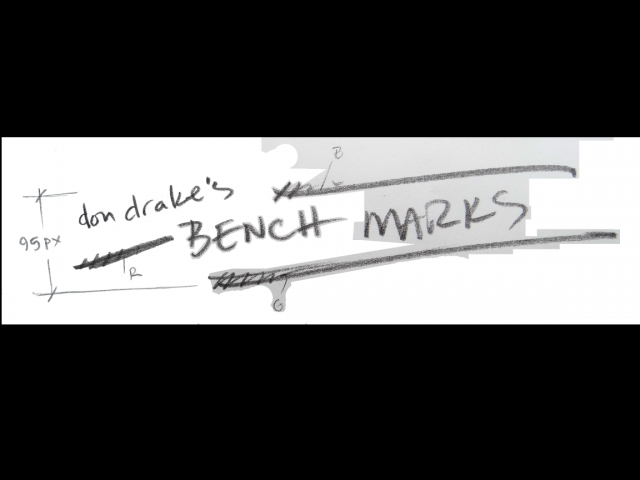
I waned to have some marginalia and callouts in the design though. And the super-small writing wasn't really giving me what I wanted so I tried a third version.
I liked branding with my name in the previous version and the basic elements had some promise.
This one has some potential so I'm doing some clean-up to develop it.
Shooting these paper scraps is not giving me a good, white background so there is a lo of tedious work to do. I experimented with a variety of curve, level, darken-layer, multiply-layer and other tricks to drop he background tone. But I kept loosing density in the pencil strokes. Especially those tiny, light callouts and dimensions.
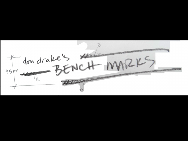
As I worked with the design I started to see design-noise. The first big problem was the different angle for my name and the prefix-stroke.
A slight rotation really helped integrate the design.
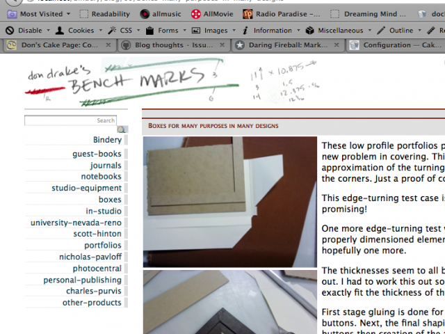
I wasn't 100% sold on this design as the clean-up went forward. But there is a lot to be learned as the elements resolve, so I pushed forward to the prototype.
You can see I made a few other changes.
- I moved the G callout to save vertical space
- I moved the B callout to save vertical space. I also changed it to a 3. Since I'm not doing a web design blog, the RGB callouts seemed inappropriate. But making one of them a number felt like a good nod to the somewhat random and inconsistent nature of my process.
- I deleted the dimension on the left
- I tweaked out a new 'd' for my first name
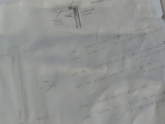
- I added some real bench notes from a current job on the right. You can find scraps that look just like this all around the studio.
- Lastly, I added he colorization to the elements.
Several problems are apparent a this point. The design is too tentative on the page; too light, poorly anchored on the page, and the feel of the art is not in harmony with the rest of the page elements.
The other page elements could change though (and the article layout and styling DEFINITELY will) so, the feel of the banner may just need adjustment and polish.
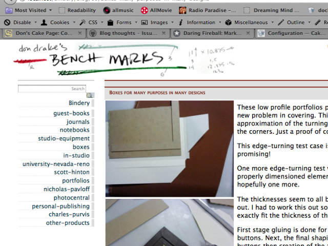
Testing a version of Don Drake's Bench Mark blog banner design on a rough page.
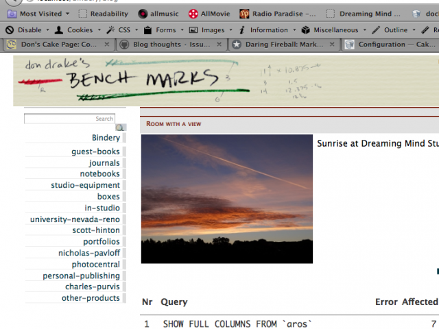
Another photo, this time of some Strathmore laid paper I have in the studio, helps add some further integration to the banner elements. I like that he notes on the right really start to look like writing-on-paper again.
That element could work as a background to the whole page.
A good days work I guess.
Expanding design attention to the larger page
To take the banner further I think it's time to bring the rest of the page along a little. I had done some sketches a few days earlier. My plan was to have a column on the left with alternating 2 and 3 images across in alternating rows, and a column on the right with the text. These two columns would scroll. At the top of the picture column would be one large picture and this would be the picture paired with the paragraphs currently scrolled to the top. The smaller images would scroll behind this large picture.
A complicated plan requiring a lot of javascript.
This was a first dump of images into the rough configuration so I could see how things might play out.
Uncovering a serious design flaw
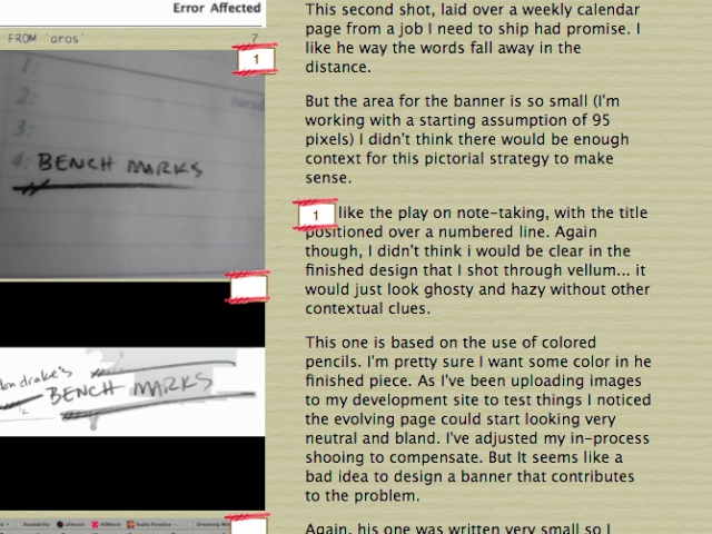
After playing with the rough layout for a bit it became clear my complicated had a serious weakness. My system is written to store picture/text pairings but this layout decouples the text and images. Without some visual clues to help the viewer connect some segment of text with a specific image, a reader would be pretty much lost and frustrated if they tried to make any sense of the content. So I started to play with a way to number the text chunks and images. More complication. A really bad plan then.
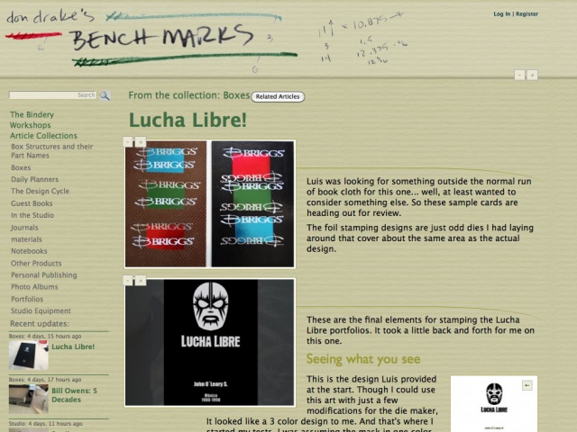
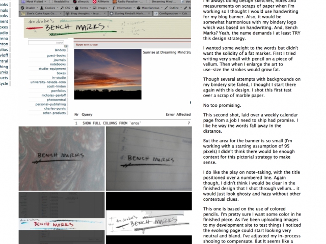
Screen capture of Don Drake's Bench Marks blog during the design process
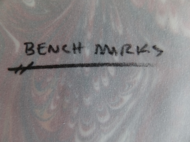
Typical bench notes for a box project
