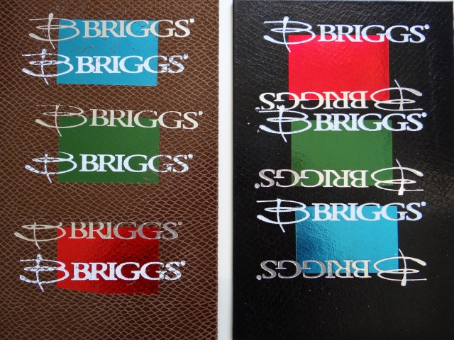
Luis was looking for something outside the normal run of book cloth for this one... well, at least wanted to consider something else. So these sample cards are heading out for review.
The foil stamping designs are just odd dies I had laying around that cover about the same area as the actual design.

These are the final elements for stamping the Lucha Libre portfolios. It took a little back and forth for me on this one.
Seeing what you see
 This is the design Luis provided at the start. Though I could use this art with just a few modifications for the die maker, It looked like a 3 color design to me. And that's where I started my tests. I was assuming the mask in one color, the burst-decorations on the mask in a second, and the type in a third. That was the basis for the sample cards I sent.
Negotiating for change
 After receiving the samples, Luis told me he envisioned just sliver stamping and he selected the black cloth. I still thought 2 color might work well, so I sent this design comp vial email to help him see the alternative.
Still a no-go on color in his opinion. I don't actually like one version over the other at this point. But it is interesting that the second color softens the impact a little bit. The one color seems more violent.
Dialing in the details
 At this point we moved on to the type. I think the original Arial shown in this image is a bit stodgy for the subject matter. I hunted around for some alternatives and found Impact worked well with his title art. But Impact didn't have alternative weights. So I did a little work on the font outlines in Illustrator and got something that, I think, has the right weight and just enough informality for the piece.

These are the final elements for stamping the Lucha Libre portfolios. It took a little back and forth for me on this one.
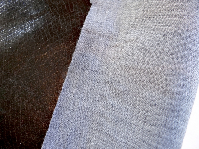
This material is not the traditional, paper back book cloth used in many of my bindings. I could go through the process of backing it myself. But in this application and with this cloth there is no need.
I will have to employ a different technique with my adhesives, but this particular material should perform in a pretty normal way.
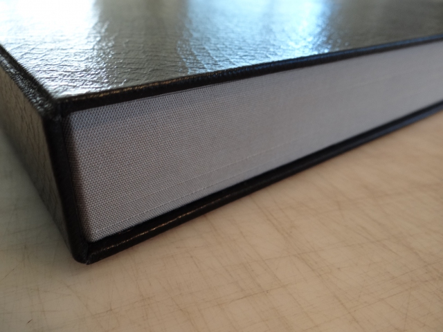
I picked up some new silver cloth to use for the rails of this box. Looks pretty good I think.
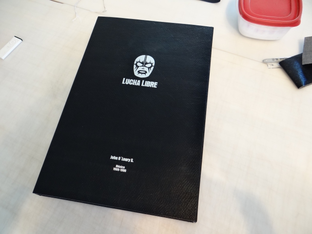
Though we agreed to make three boxes with this cloth, I decided to send the first one to Luis and John for review before I finish the other two.
I had a certain amount of trouble with the cloth and the hinges are a bit stiffer than in the other boxes of this style I've delivered.
There were a lot of little differences and I'd feel better getting a go-ahead before finishing up.
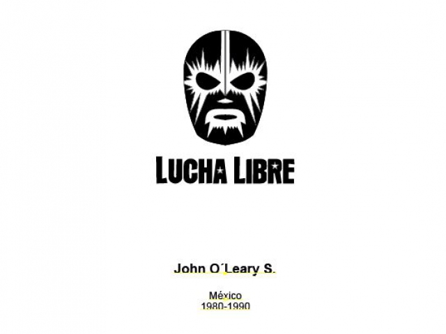
Provided Lucha Libre hot stamp design elements

A two color proposal for the Lucha Libre hot stamp design

The Lucha Libre hot stamp design with the original Arial
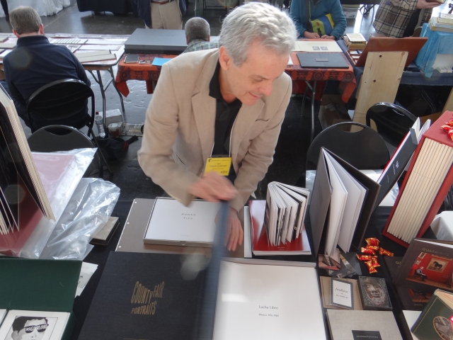
Luis Delgado displays Malulu's portfolio of John O'Leary's 'Lucha Libre' images at the 2013 Codex in the Craneway Pavillion, Richmond, CA
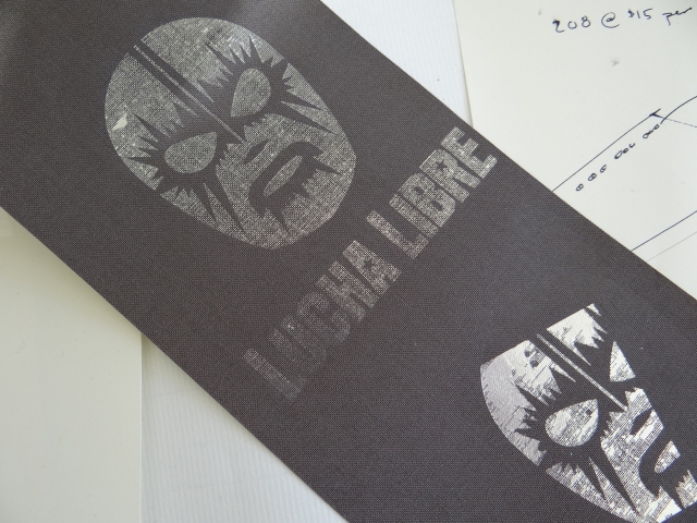
Foil stamping with a die that is too large.
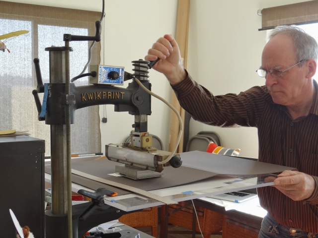
Hot stamping a large box case with the Kwikprint Model 86
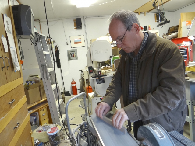
Sanding the rails for a box to the proper dimensions
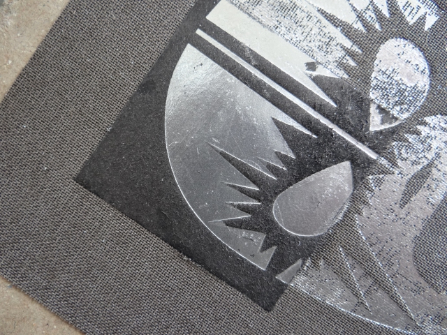
Testing a cardstock inlay in a colth covered case
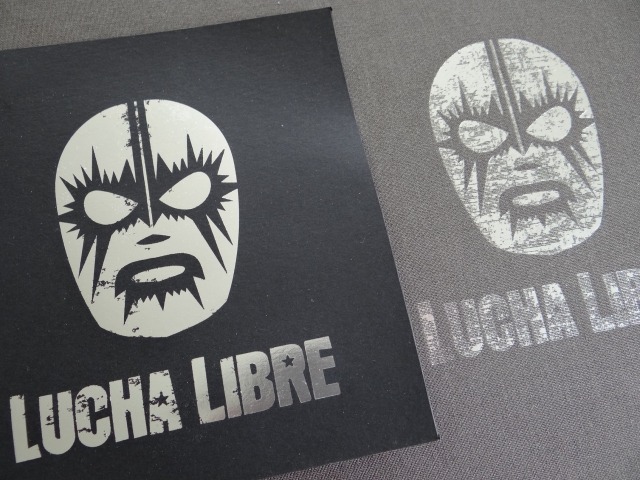
Comparing two hot foil stampings on different materials at the same pressure and temperature
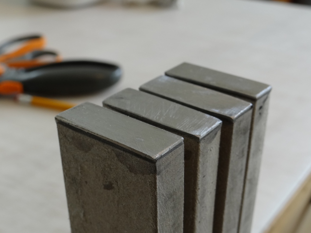
The steel strike plates on the ends of the rails ready for covering